seeing that the first condition of your drawing is that it has to be made on a flat surface, no matter whether it is to be in line or mass you intend to draw, it is obvious that appearances must be reduced to terms of a flat surface before they can be expressed on paper. and this is the first difficulty that confronts the student in attempting to draw a solid object. he has so acquired the habit of perceiving the solidity of things, as was explained in an earlier chapter, that no little difficulty will be experienced in accurately seeing them as a flat picture.
observing solids as a flat copy.
as it is only from one point of view that things can be drawn, and as we have two eyes, therefore two points of view, the closing of one eye will be helpful at first.
the simplest and most mechanical way of observing things as a flat subject is to have a piece of cardboard with a rectangular hole cut out of the middle, and also pieces of cotton threaded through it in such a manner that they make a pattern of squares across the opening, as in the accompanying sketch. to make such a frame, get a piece of stiff cardboard, about 12 inches by 9 inches, and cut a rectangular hole in the centre, 7 inches by 5 inches, as in diagram iii. now mark off the inches on 85all sides of the opening, and taking some black thread, pass it through the point a with a needle (fixing the end at this point with sealing-wax), and across the opening to the corresponding point on the opposite side. take it along to the next point, as shown by the dotted line, and pass it through and across the opening again, and so on, until b is reached, when the thread should be held by some sealing-wax quite taut everywhere. do the same for the other side. this frame should be held between the eye and the object to be drawn 86(one eye being closed) in a perfectly vertical position, and with the rectangular sides of the opening vertical and horizontal. the object can then be observed as a flat copy. the trellis of cotton will greatly help the student in seeing the subject to be drawn in two dimensions, and this is the first technical difficulty the young draughtsman has to overcome. it is useful also in training the eye to see the proportions of different parts one to another, the squares of equal size giving one a unit of measurement by which all parts can be scaled.
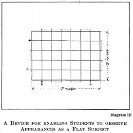
diagram iii.
a device for enabling students to observe appearances as a flat subject
fixing positions of salient points
vertical and horizontal lines are also of the utmost importance in that first consideration for setting out a drawing, namely the fixing of salient points, and getting their relative positions. fig. z, on page 87 [transcribers note: diagram iv], will illustrate what is meant. let a b c d e be assumed to be points of some importance in an object you wish to draw. unaided, the placing of these points would be a matter of considerable difficulty. but if you assume a vertical line drawn from a, the positions of b, c, d, and e can be observed in relation to it by noting the height and length of horizontal lines drawn from them to this vertical line. this vertical can be drawn by holding a plumb line at arm's length (closing one eye, of course) and bringing it to a position where it will cover the point a on your subject. the position of the other points on either side of this vertical line can then be observed. or a knitting-needle can be held vertically before you at arm's length, giving you a line passing through point a. the advantage of the needle is that comparative measurements can be taken with it.
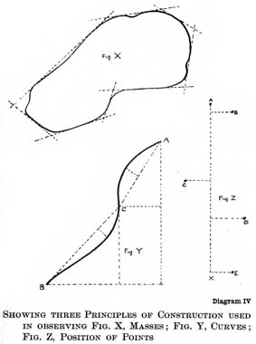
diagram iv.
showing three principles of construction used in observing fig. x, masses; fig. y, curves; fig. z, position of points
88in measuring comparative distances the needle should always be held at arm's length and the eye kept in one position during the operation; and, whether held vertically or horizontally, always kept in a vertical plane, that is, either straight up and down, or across at right angles to the line of your vision. if these things are not carefully observed, your comparisons will not be true. the method employed is to run the thumb-nail up the needle until the distance from the point so reached to the top exactly corresponds with the distance on the object you wish to measure. having this carefully noted on your needle, without moving the position of your eye, you can move your outstretched arm and compare it with other distances on the object. it is never advisable to compare other than vertical and horizontal measurements. in our diagram the points were drawn at random and do not come in any obvious mathematical relationship, and this is the usual circumstance in nature. but point c will be found to be a little above the half, and point d a little less than a third of the way up the vertical line. how much above the half and less than the third will have to be observed by eye and a corresponding amount allowed in setting out your drawing. in the horizontal distances, b will be found to be one-fourth the distance from x to the height of c on the right of our vertical line, and c a little more than this distance to the left, while the distance on the right of d is a little less than one-fifth of the whole height. the height of b is so near the top as to be best judged by eye, and its distance to the right is the same as b. these measurements are never to be taken as absolutely accurate, but are a great help to beginners in training 89 the eye, and are at times useful in every artist's work.
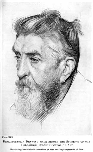
plate xvii.
demonstration drawing made before the students of the goldsmiths college school of art
illustrating how different directions of lines can help expression of form.
it is useful if one can establish a unit of measurement, some conspicuous distance that does not vary in the object (if a living model a great many distances will be constantly varying), and with which all distances can be compared.
in setting out a drawing, this fixing of certain salient points is the first thing for the student to do. the drawing reproduced on page 90 [transcribers note: plate xviii] has been made to illustrate the method of procedure it is advisable to adopt in training the eye to accurate observation. it was felt that a vertical line drawn through the pit of the arm would be the most useful for taking measurements on, and this was first drawn and its length decided upon. train yourself to draw between limits decided upon at the start. this power will be of great use to you when you wish to place a figure in an exact position in a picture. the next thing to do is to get the relative heights of different points marked upon this line. the fold at the pit of the stomach was found to be exactly in the centre. this was a useful start, and it is generally advisable to note where the half comes first, and very useful if it comes in some obvious place. other measurements were taken in the same way as our points a b c d e in the diagram on page 87 [transcribers note: diagram iv], and horizontal lines drawn across, and the transverse distances measured in relation to the heights. i have left these lines on the drawing, and also different parts of it unfinished, so as to show the different stages of the work. these guide lines are done mentally later on, when the student is more advanced, and with more accuracy than the clumsy knitting-needle. 90but before the habit of having constantly in mind a vertical and horizontal line with which to compare positions is acquired, they should be put in with as much accuracy as measuring can give.
blocking in your drawing.
the next thing to do is to block out the spaces corresponding to those occupied by the model in the field of your vision. the method employed to do this is somewhat similar to that adopted by a surveyor in drawing the plan of a field. assuming he had an irregular shaped one, such as is drawn in fig. x, page 87 [transcribers note: diagram iv], he would proceed to invest it with straight lines, taking advantage of any straightness in the boundary, noting the length and the angles at which these straight lines cut each other, and then reproducing them to scale on his plan. once having got this scaffolding accurately placed, he can draw the irregularities of the shape in relation to these lines with some certainty of getting them right.
you should proceed in very much the same way to block out the spaces that the forms of your drawing are to occupy. i have produced these blocking-out lines beyond what was necessary in the accompanying drawing (page 87 [transcribers note: diagram iv]), in order to show them more clearly.
how to observe the shape of curves.
there is yet another method of construction useful in noting accurately the shape of a curved line, which is illustrated in fig. y, page 87 [transcribers note: diagram iv]. first of all, fix the positions of the extremities of the line by means of the vertical and horizontal. and also, as this is a double curve, the point at which the curvature changes from one direction to the other: point c. by drawing lines ca, cb and noting the distances 91your curves travel from these straight lines, and particularly the relative position of the farthest points reached, their curvature can be accurately observed and copied. in noting the varying curvature of forms, this construction should always be in your mind to enable you to observe them accurately. first note the points at which the curvature begins and ends, and then the distances it travels from a line joining these two points, holding up a pencil or knitting-needle against the model if need be.
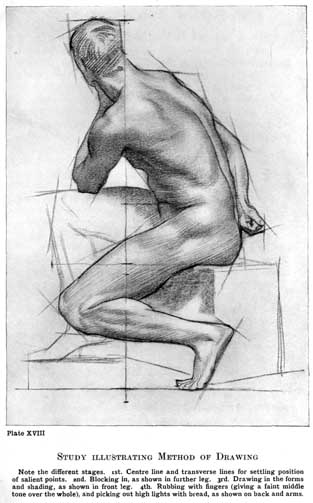
plate xviii.
study illustrating method of drawing
note the different stages. 1st. centre line and transverse lines for settling position of salient points. 2nd. blocking in, as shown in further leg. 3rd. drawing in the forms and shading, as shown in front leg. 4th. rubbing with fingers (giving a faint middle tone over the whole), and picking out high lights with bread, as shown on back and arms.
the drawing proper.
a drawing being blocked out in such a state as the further leg and foot of our demonstration drawing (page 90 [transcribers note: plate xviii]), it is time to begin the drawing proper. so far you have only been pegging out the ground it is going to occupy. this initial scaffolding, so necessary to train the eye, should be done as accurately as possible, but don't let it interfere with your freedom in expressing the forms afterwards. the work up to this point has been mechanical, but it is time to consider the subject with some feeling for form. here knowledge of the structure of bones and muscles that underlie the skin will help you to seize on those things that are significant and express the form of the figure. and the student cannot do better than study the excellent book by sir alfred d. fripp on this subject, entitled human anatomy for art students. notice particularly the swing of the action, such things as the pull occasioned by the arm resting on the farther thigh, and the prominence given to the forms by the straining of the skin at the shoulder. also the firm lines of the bent back and the crumpled forms of the front of the body. notice the overlapping of the con92tours, and where they are accentuated and where more lost, &c., drawing with as much feeling and conviction as you are capable of. you will have for some time to work tentatively, feeling for the true shapes that you do not yet rightly see, but as soon as you feel any confidence, remember it should be your aim to express yourself freely and swiftly.
there is a tendency in some quarters to discourage this blocking in of the forms in straight lines, and certainly it has been harmful to the freedom of expression in the work of some students. they not only begin the drawing with this mechanical blocking in, but continue it in the same mechanical fashion, cutting up almost all their curves into flatnesses, and never once breaking free from this scaffolding to indulge in the enjoyment of free line expression. this, of course, is bad, and yet the character of a curved line is hardly to be accurately studied in any other way than by observing its relation to straight lines. the inclination and length of straight lines can be observed with certainty. but a curve has not this definiteness, and is a very unstable thing to set about copying unaided. who but the highly skilled draughtsman could attempt to copy our random shape at fig. x, page 87 [transcribers note: diagram iv], without any guiding straight lines? and even the highly skilled draughtsman would draw such straight lines mentally. so that some blocking out of the curved forms, either done practically or in imagination, must be adopted to rightly observe any shapes. but do not forget that this is only a scaffolding, and should always be regarded as such and kicked away as soon as real form expression with any feeling begins.
93but it will be some years before the beginner has got his eye trained to such accuracy of observation that he can dispense with it.
in blocking-in observe shape of the background as much as the object.
in the case of foreshortenings, the eye, unaided by this blocking out, is always apt to be led astray. and here the observation of the shape of the background against the object will be of great assistance. the appearance of the foreshortened object is so unlike what you know it to be as a solid thing, that much as it is as well to concentrate the attention on the background rather than on the form in this blocking-out process. and in fact, in blocking out any object, whether foreshortened or not, the shape of the background should be observed as carefully as any other shape. but in making the drawing proper, the forms must be observed in their inner relations. that is to say, the lines bounding one side of a form must be observed in relation to the lines bounding the other side; as the true expression of form, which is the object of drawing, depends on the true relationship of these boundaries. the drawing of the two sides should be carried on simultaneously, so that one may constantly compare them.
boundaries a series of overlappings.
the boundaries of forms with any complexity, such as the human figure, are not continuous lines. one form overlaps another, like the lines of a range of hills. and this overlapping should be sought for and carefully expressed, the outlines being made up of a series of overlappings.
shading.
in line drawing shading should only be used to aid the expression of form. it is not advisable to aim at representing the true tone values.
94in direct light it will be observed that a solid object has some portion of its surface in light, while other portions, those turned away from the light, are in shadow. shadows are also cast on the ground and surrounding objects, called cast shadows. the parts of an object reflecting the most direct light are called the high lights. if the object have a shiny surface these lights are clear and distinct; if a dull surface, soft and diffused. in the case of a very shiny surface, such as a glazed pot, the light may be reflected so completely that a picture of the source of light, usually a window, will be seen.
in the diagram on page 95 [transcribers note: diagram v], let a represent the plan of a cone, b c the opening of a window, and d the eye of the spectator, and e f g the wall of a room. light travels in straight lines from the window, strikes the surface of the cone, and is reflected to the eye, making the angle of incidence equal to the angle of reflection, the angle of incidence being that made by the light striking an object, and the angle of reflection that made by the light in leaving the surface.
it will be seen that the lines b1d, c2d are the limits of the direct rays of light that come to the eye from the cone, and that therefore between points 1 and 2 will be seen the highest light. if the cone have a perfect reflecting surface, such as a looking-glass has, this would be all the direct light that would be reflected from the cone to the eye. but assuming it to have what is called a dull surface, light would be reflected from other parts also, although not in so great a quantity. if what is called a dull surface is looked at under a microscope it will be found to be quite rough, 96i.e. made up of many facets which catch light at different angles.
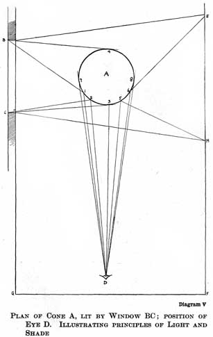
diagram v.
plan of cone a, lit by window bc; position of eye d. illustrating principles of light and shade
lines b4, c3 represent the extreme limits of light that can be received by the cone, and therefore at points 3 and 4 the shadow will commence. the fact that light is reflected to the eye right up to the point 3 does not upset the theory that it can only be reflected from points where the angle of incidence can equal the angle of reflection, as it would seem to do, because the surface being rough presents facets at different angles, from some of which it can be reflected to the eye right up to point 3. the number of these facets that can so reflect is naturally greatest near the high lights, and gets gradually less as the surface turns more away; until the point is reached where the shadows begin, at which point the surface positively turns away from the light and the reflection of direct light ceases altogether. after point 3 there would be no light coming to the eye from the object, were it not that it receives reflected light. now, the greatest amount of reflected light will come from the direction opposite to that of the direct light, as all objects in this direction are strongly lit. the surface of the wall between points e and h, being directly opposite the light, will give most reflection. and between points 5 and 6 this light will be reflected by the cone to the eye in its greatest intensity, since at these points the angles of incidence equal the angles of reflection. the other parts of the shadow will receive a certain amount of reflected light, lessening in amount on either side of these points. we have now rays of light coming to the eye from the cone between the extreme points 7 and 8. from 7 to 3 we have 97the light, including the half tones. between 1 and 2 the high light. between 3 and 8 the shadows, with the greatest amount of reflected light between 5 and 6.
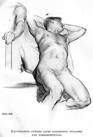
plate xix.
illustrating curved links suggesting fullness and foreshortening
i should not have troubled the reader with this tedious diagram were it not that certain facts about light and shade can be learned from it. the first is that the high lights come much more within the edge of the object than you would have expected. with the light directly opposite point 7, one might have thought the highest light would have come there, and that is where many students put it, until the loss of roundness in the appearance of their work makes them look more carefully for its position. so remember always to look out for high lights within the contours of forms, not on the edges.
the next thing to notice is that the darkest part of the shadow will come nearest the lights between points 3 and 5. this is the part turned most away from the direction of the greatest amount of reflected light, and therefore receiving least. the lightest part of the shadow will be in the middle, rather towards the side away from the light, generally speaking. the shadow cast on the ground will be dark, like the darkest part of the shadow on the cone, as its surface is also turned away from the chief source of reflected light.
although the artist will very seldom be called upon to draw a cone, the same principles of light and shade that are so clearly seen in such a simple figure obtain throughout the whole of nature. this is why the much abused drawing and shading from whitened blocks and pots is so useful. nothing so clearly impresses the general laws of light and shade as this so-called dull study.
98this lightening of shadows in the middle by reflected light and darkening towards their edges is a very important thing to remember, the heavy, smoky look students' early work is so prone to, being almost entirely due to their neglect through ignorance of this principle. nothing is more awful than shadows darker in the middle and gradually lighter towards their edges. of course, where there is a deep hollow in the shadow parts, as at the armpit and the fold at the navel in the drawing on page 90 [transcribers note: plate xviii], you will get a darker tone. but this does not contradict the principle that generally shadows are lighter in the middle and darker towards the edges. note the luminous quality the observation of this principle gives the shadow on the body of our demonstration drawing.
this is a crude statement of the general principles of light and shade on a simple round object. in one with complex surfaces the varieties of light and shade are infinite. but the same principles hold good. the surfaces turned more to the source of light receive the greatest amount, and are the lightest. and from these parts the amount of light lessens through what are called the half tones as the surface turns more away, until a point is reached where no more direct light is received, and the shadows begin. and in the shadows the same law applies: those surfaces turned most towards the source of reflected light will receive the most, and the amount received will gradually lessen as the surface turns away, until at the point immediately before where the half tones begin the amount of reflected light will be very little, and in consequence the darkest part of the shadows may be looked for. there may, of course, be other sources of direct 99light on the shadow side that will entirely alter and complicate the effect. or one may draw in a wide, diffused light, such as is found in the open air on a grey day; in which case there will be little or no shadow, the modelling depending entirely on degrees of light and half tone.
in studying the principles of simple light and shade it is advisable to draw from objects of one local colour, such as white casts. in parti-coloured objects the problem is complicated by the different tones of the local colour. in line drawing it is as well to take as little notice as possible of these variations which disturb the contemplation of pure form and do not belong to the particular province of form expression with which drawing is concerned.
although one has selected a strong half light and half shade effect to illustrate the general principles of light and shade, it is not advisable in making line drawings to select such a position. a point of view with a fairly wide light at your back is the best. in this position little shadow will be seen, most of the forms being expressed by the play of light and half tone. the contours, as they are turned away from the light, will naturally be darker, and against a light background your subject has an appearance with dark edges that is easily expressed by a line drawing. strong light and shade effects should be left for mass drawing. you seldom see any shadows in holbein's drawings; he seems to have put his sitters near a wide window, close against which he worked. select also a background as near the tone of the highest light on the object to be drawn as possible. this will show up clearly the contour. in the case of a portrait drawing, a newspaper hung behind the head answers very well and 100is always easily obtained. the tone of it can be varied by the distance at which it is placed from the head, and by the angle at which it is turned away from or towards the light.
don't burden a line drawing with heavy half tones and shadows; keep them light. the beauty that is the particular province of line drawing is the beauty of contours, and this is marred by heavy light and shade. great draughtsmen use only just enough to express the form, but never to attempt the expression of tone. think of the half tones as part of the lights and not as part of the shadows.
there are many different methods of drawing in line, and a student of any originality will find one that suits his temperament. but i will try and illustrate one that is at any rate logical, and that may serve as a fair type of line drawing generally.
the appearance of an object is first considered as a series of contours, some forming the boundaries of the form against the background, and others the boundaries of the subordinate forms within these bounding lines. the light and shade and differences of local colour (like the lips, eyebrows, and eyes in a head) are considered together as tones of varying degrees of lightness and darkness, and suggested by means of lines drawn parallel across the drawing from left to right, and from below upwards, or vice versa, darker and closer together when depth is wanted, and fainter and further apart where delicacy is demanded, and varying in thickness when gradation is needed. this rule of parallel shading is broken only when strongly marked forms, such as the swing lines of hair, a prominent bone or straining muscles, &c., demand it. this parallel shading gives a great beauty of 101surface and fleshiness to a drawing. the lines following, as it were, the direction of the light across the object rather than the form, give a unity that has a great charm. it is more suited to drawings where extreme delicacy of form is desired, and is usually used in silver point work, a medium capable of the utmost refinement.
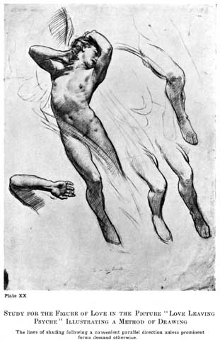
plate xx.
study for the figure of love in the picture "love leaving psyche" illustrating a method of drawing
the lines of shading following a convenient parallel direction unless prominent forms demand otherwise.
in this method the lines of shading not being much varied in direction or curved at all, a minimum amount of that "form stimulus" is conveyed. the curving of the lines in shading adds considerably to the force of the relief, and suggests much stronger modelling. in the case of foreshortened effects, where the forms are seen at their fullest, arching one over the other, some curvature in the lines of shading is of considerable advantage in adding to the foreshortened look.
lines drawn down the forms give an appearance of great strength and toughness, a tense look. and this quality is very useful in suggesting such things as joints and sinews, rocks, hard ground, or gnarled tree-trunks, &c. in figure drawing it is an interesting quality to use sparingly, with the shading done on the across-the-form principle; and to suggest a difference of texture or a straining of the form. lines of shading drawn in every direction, crossing each other and resolving themselves into tone effects, suggest atmosphere and the absence of surface form. this is more often used in the backgrounds of pen and ink work and is seldom necessary in pencil or chalk drawing, as they are more concerned with form than atmosphere. pen and ink is more often used for elaborate pictorial effects in illustration work, owing to the ease with which it can be reproduced and printed; and it is 102here that one more often finds this muddled quality of line spots being used to fill up interstices and make the tone even.
speaking generally, lines of shading drawn across the forms suggest softness, lines drawn in curves fulness of form, lines drawn down the forms hardness, and lines crossing in all directions so that only a mystery of tone results, atmosphere. and if these four qualities of line be used judiciously, a great deal of expressive power is added to your shading. and, as will be explained in the next chapter, somewhat the same principle applies to the direction of the swing of the brush in painting.
shading lines should never be drawn backwards and forwards from left to right (scribbled), except possibly where a mystery of shadow is wanted and the lines are being crossed in every direction; but never when lines are being used to express form. they are not sufficiently under control, and also the little extra thickness that occurs at the turn is a nuisance.
the crossing of lines in shading gives a more opaque look. this is useful to suggest the opaque appearance of the darker passage that occurs in that part of a shadow nearest the lights; and it is sometimes used in the half tones also.
draughtsmen vary very much in their treatment of hair, and different qualities of hair require different treatment. the particular beauty of it that belongs to point drawing is the swing and flow of its lines. these are especially apparent in the lights. in the shadows the flow of line often stops, to be replaced by a mystery of shadow. so that a play of swinging lines alternating with shadow passages, drawn like all the other shadows 103with parallel lines not following the form, is often effective, and suggests the quality of hair in nature. the swinging lines should vary in thickness along their course, getting darker as they pass certain parts, and gradating into lighter lines at other parts according to the effect desired. (see illustration, page 102 [transcribers note: plate xxi].)
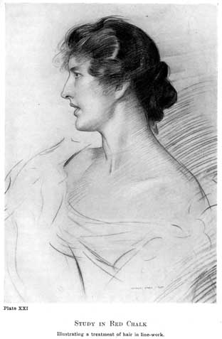
plate xxi.
study in red chalk
illustrating a treatment of hair in line-work.
to sum up, in the method of line drawing we are trying to explain (the method employed for most of the drawings by the author in this book) the lines of shading are made parallel in a direction that comes easy to the hand, unless some quality in the form suggests their following other directions. so that when you are in doubt as to what direction they should follow, draw them on the parallel principle. this preserves a unity in your work, and allows the lines drawn in other directions for special reasons to tell expressively.
as has already been explained, it is not sufficient in drawing to concentrate the attention on copying accurately the visual appearance of anything, important as the faculty of accurate observation is. form to be expressed must first be appreciated. and here the science of teaching fails. "you can take a horse to the fountain, but you cannot make him drink," and in art you can take the student to the point of view from which things are to be appreciated, but you cannot make him see. how, then, is this appreciation of form to be developed? simply by feeding. familiarise yourself with all the best examples of drawing you can find, trying to see in nature the same qualities. study the splendid drawing by puvis de chavannes reproduced on page 104 [transcribers note: plate xxii]. note the way the contours have been searched for expressive qualities. look how 104the expressive line of the back of the seated figure has been "felt," the powerful expression of the upraised arm with its right angle (see later page 155 [transcribers note: diagram xii], chapter on line rhythm). and then observe the different types of the two standing figures; the practical vigour of the one and the soft grace of the other, and how their contours have been studied to express this feeling, &c. there is a mine of knowledge to be unearthed in this drawing.
there never was an age when such an amount of artistic food was at the disposal of students. cheap means of reproduction have brought the treasures of the world's galleries and collections to our very doors in convenient forms for a few pence. the danger is not from starvation, but indigestion. students are so surfeited with good things that they often fail to digest any of them; but rush on from one example to another, taking but snapshot views of what is offered, until their natural powers of appreciation are in a perfect whirlwind of confused ideas. what then is to be done? you cannot avoid the good things that are hurled at you in these days, but when you come across anything that strikes you as being a particularly fine thing, feed deeply on it. hang it up where you will see it constantly; in your bedroom, for instance, where it will entertain your sleepless hours, if you are unfortunate enough to have any. you will probably like very indifferent drawings at first, the pretty, the picturesque and the tricky will possibly attract before the sublimity of finer things. but be quite honest and feed on the best that you genuinely like, and when you have thoroughly digested and comprehended that, you will weary of it and long for something better, and so, gradually, 105be led on to appreciate the best you are capable of appreciating.
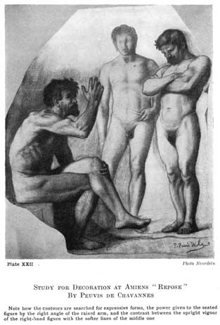
plate xxii.
study for decoration at amiens "repose" by peuvis de chavannes
note how the contours are searched for expressive forms, the power given to the seated figure by the right angle of the raised arm, and the contrast between the upright vigour of the right-hand figure with the softer lines of the middle one.
photo neurdein
before closing this chapter there are one or two points connected with the drawing of a head that might be mentioned, as students are not always sufficiently on the look out for them.
in our diagram on page 107 [transcribers note: diagram vi], let fig. 1 represent a normal eye. at fig. 2 we have removed the skin and muscles and exposed the two main structural features in the form of the eye, namely the bony ring of the socket and the globe containing the lenses and retina. examining this opening, we find from a to b that it runs smoothly into the bony prominence at the top of the nose, and that the rest of the edge is sharp, and from point c to e quite free. it is at point a, starting from a little hole, that the sharp edge begins; and near this point the corner of the eye is situated: a, figs. 1, 2, 3. from points a to f the bony edge of the opening is very near the surface and should be looked for.
the next thing to note is the fact that the eyebrow at first follows the upper edge of the bony opening from b to c, but that from point c it crosses the free arch between c and d and soon ends. so that considering the under side of the eyebrow, whereas from point c towards b there is usually a cavernous hollow, from c towards d there is a prominence. the character of eyes varies greatly, and this effect is often modified by the fleshy fulness that fills in the space between the eyelid and the brow, but some indication of a change is almost always to be observed at a point somewhere about c, and should be looked out for. any bony prominence from this point towards d 106should be carefully constructed. look out for the bone, therefore, between the points cd and af.
never forget when painting an eye that what we call the white of the eye is part of a sphere and will therefore have the light and shade of a sphere. it will seldom be the same tone all over; if the light is coming from the right, it will be in shade towards the left and vice versa. also the eyelids are bands of flesh placed on this spherical surface. they will therefore partake of the modelling of the sphere and not be the same tone all across. note particularly the sudden change of plane usually marked by a fold, where the under eyelid meets the surface coming from the cheek bone. the neglect to construct these planes of the under eyelid is a very common fault in poorly painted eyes. note also where the upper eyelid comes against the flesh under the eyebrow (usually a strongly marked fold) and the differences of planes that occur at this juncture. in some eyes, when there is little loose flesh above the eyelid, there is a deep hollow here, the eyelid running up under the bony prominence, c d. this is an important structural line, marking as it does the limit of the spherical surface of the eyeball, on which surface the eyelids are placed.
fig. 4 is a rough diagram of the direction it is usual for the hairs forming the eyebrow to take. from a a few scant hairs start radiating above the nose and quite suddenly reach their thickest and strongest growth between b and e. they continue, still following a slightly radiating course until d. these hairs are now met by another lot, starting from above downwards, and growing from. b to c. an eyebrow is considered by the draughtsman 108 as a tone of a certain shape and qualities of edge. and what interests us here is to note the effect of this order of growth upon its appearance as tone. the meeting of the strong growth of hair upwards with the downward growth between points b and e creates what is usually the darkest part of the eyebrow at this point. and the coming together of the hairs towards d often makes another dark part in this direction. the edge from c to b is nearly always a soft one, the tone melting into the flesh, and this should be looked out for, giving as it does a pretty variety to the run of the line. another thing that tends to make this edge soft is the fact that a bony prominence is situated here and has usually a high light upon it that crosses the eyebrow. from c to d you usually find a sharper edge, the hairs running parallel to the line of the eyebrow, while from d to b and a to b a softer boundary can be looked for. the chief accent will generally be found at b, where a dark mass often comes sharply against the tone of the forehead.
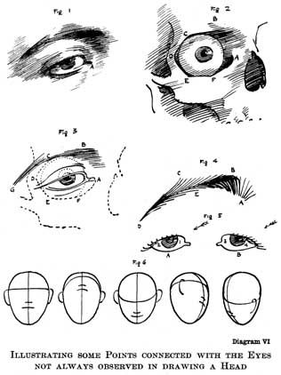
diagram vi.
illustrating some points connected with the eyes not always observed in drawing a head
the eyelashes do not count for much in drawing a head, except in so far as they affect the tone impression. in the first place they shade the white of the eye when the light is above, as is usually the case. they are much thicker on the outer than on the inner side of the eyelids, and have a tendency to grow in an outward direction, so that when the light comes from the left, as is shown by arrow, fig. 5, the white of the eye at a1 will not be much shaded, and the light tone will run nearly up to the top. but at b4, which should be the light side of this eye, the thick crop of eyelashes will shade it somewhat and the light will not 109run far up in consequence, while b3, a2 will be in the shade from the turning away from the direction of the light of the spherical surface of the whites of the eyes.
these may seem small points to mention, but the observance of such small points makes a great difference to the construction of a head.
fig. 6 gives a series of blocks all exactly alike in outline, with lines showing how the different actions of the head affect the guide lines on which the features hang; and how these actions can be suggested even when the contours are not varied. these archings over should be carefully looked out for when the head is in any but a simple full face position.
