rules and canons of proportion designed to reduce to a mathematical formula the things that move us in beautiful objects, have not been a great success; the beautiful will always defy such clumsy analysis. but however true it is that beauty of proportion must ever be the result of the finer senses of the artist, it is possible that canons of proportion, such as those of the human body, may be of service to the artist by offering some standard from which he can depart at the dictates of his artistic instinct. there appears to be no doubt that the ancient sculptors used some such system. and many of the renaissance painters were interested in the subject, leonardo da vinci having much to say about it in his book.
like all scientific knowledge in art, it fails to trap the elusive something that is the vital essence of the whole matter, but such scientific knowledge does help to bring one's work up to a high point of mechanical perfection, from which one's artistic instinct can soar with a better chance of success than if no scientific scaffolding had been used in the initial building up. yet, however perfect your system, don't forget that the life, the "dither," will still have to be accounted for, and no science will help you here.
the idea that certain mathematical proportions 228or relationships underlie the phenomena we call beauty is very ancient, and too abstruse to trouble us here. but undoubtedly proportion, the quantitative relation of the parts to each other and to the whole, forms a very important part in the impression works of art and objects give us, and should be a subject of the greatest consideration in planning your work. the mathematical relationship of these quantities is a subject that has always fascinated scholars, who have measured the antique statues accurately and painstakingly to find the secret of their charm. science, by showing that different sounds and different colours are produced by waves of different lengths, and that therefore different colours and sounds can be expressed in terms of numbers, has certainly opened the door to a new consideration of this subject of beauty in relation to mathematics. and the result of such an inquiry, if it is being or has been carried on, will be of much interest.
but there is something chilling to the artist in an array of dead figures, for he has a consciousness that the life of the whole matter will never be captured by such mechanical means.
the question we are interested to ask here is: are there particular sentiments connected with the different relations of quantities, their proportions, as we found there were in connection with different arrangements of lines and masses? have abstract proportions any significance in art, as we found abstract line and mass arrangements had? it is a difficult thing to be definite about, and i can only give my own feeling on the matter; but i think in some degree they have.
proportion can be considered from our two points of view of unity and variety. in so far as 229the proportions of any picture or object resolve themselves into a simple, easily grasped unity of relationship, a sense of repose and sublimity is produced. in so far as the variety of proportion in the different parts is assertive and prevents the eye grasping the arrangement as a simple whole, a sense of the lively restlessness of life and activity is produced. in other words, as we found in line arrangements, unity makes for sublimity, while variety makes for the expression of life. of course the scale of the object will have something to do with this. that is to say, the most sublimely proportioned dog-kennel could never give us the impression of sublimity produced by a great temple. in pictures the scale of the work is not of so great importance, a painting or drawing having the power of giving the impression of great size on a small scale.
the proportion that is most easily grasped is the half—two equal parts. this is the most devoid of variety, and therefore of life, and is only used when an effect of great repose and aloofness from life is wanted; and even then, never without some variety in the minor parts to give vitality. the third and the quarter, and in fact any equal proportions, are others that are easily grasped and partake in a lesser degree of the same qualities as the half. so that equality of proportion should be avoided except on those rare occasions when effects remote from nature and life are desired. nature seems to abhor equalities, never making two things alike or the same proportion if she can help it. all systems founded on equalities, as are so many modern systems of social reform, are man's work, the products of a machine-made age. for this is the difference between nature and the 230machine: nature never produces two things alike, the machine never produces two things different. man could solve the social problem to-morrow if you could produce him equal units. but if all men were alike and equal, where would be the life and fun of existence? it would depart with the variety. and in proportion, as in life, variety is the secret of vitality, only to be suppressed where a static effect is wanted. in architecture equality of proportion is more often met with, as the static qualities of repose are of more importance here than in painting. one meets it on all fine buildings in such things as rows of columns and windows of equal size and distances apart, or the continual repetition of the same forms in mouldings, &c. but even here, in the best work, some variety is allowed to keep the effect from being quite dead, the columns on the outside of a greek pediment being nearer together and leaning slightly inwards, and the repeated forms of windows, columns, and mouldings being infinitely varied in themselves. but although you often find repetitions of the same forms equidistant in architecture, it is seldom that equality of proportion is observable in the main distribution of the large masses.
let us take our simple type of composition, and in diagram xxviii, a, put the horizon across the centre and an upright post cutting it in the middle of the picture. and let us introduce two spots that may indicate the position of birds in the upper spaces on either side of this.
here we have a maximum of equality and the deadest and most static of results.
to see these diagrams properly it is necessary to cover over with some pieces of notepaper all but 231the one being considered, as they affect each other when seen together, and the quality of their proportion is not so readily observed.
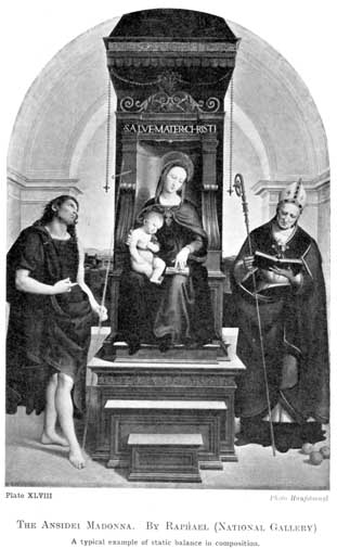
plate xlviii.
the ansidei madonna. by raphael (national gallery)
a typical example of static balance in composition.
photo hanfstaengl
in many pictures of the madonna, when a hush and reverence are desired rather than exuberant life, the figure is put in the centre of the canvas, equality of proportion existing between the spaces on either side of her. but having got the repose this centralisation gives, everything is done to conceal this equality, and variety in the contours on either side, and in any figures there may be, is carefully sought. raphael's "ansidei madonna," in the national gallery, is an instance of this (p. 230). you have first the centralisation of the figure of the madonna with the throne on which she sits, exactly in the middle of the picture. not only is the throne in the centre of the picture, but its width is exactly that of the spaces on either side of it, giving us three equal proportions across the picture. then you have the circular lines of the arches behind, curves possessed of the least possible amount of variety and therefore the calmest and most reposeful; while the horizontal lines of the steps and the vertical lines of the throne and architecture, and also the rows of hanging beads give further emphasis to this infinity of calm. but when we come to the figures this symmetry has been varied everywhere. all the heads swing towards the right, while the lines of the draperies swing freely in many directions. the swing of the heads towards the right is balanced and the eye brought back to equilibrium by the strongly-insisted-upon staff of st. nicholas on the right. the staff of st. john necessary to balance this line somewhat, is very slightly insisted on, being represented transparent 235as if made of glass, so as not to increase the swing to the right occasioned by the heads. it is interesting to note the fruit introduced at the last moment in the right-hand lower corner, dragged in, as it were, to restore the balance occasioned by the figure of the christ being on the left. in the writer's humble opinion the extremely obvious artifice with which the lines have been balanced, and the severity of the convention of this composition generally, are out of harmony with the amount of naturalistic detail and particularly of solidity allowed in the treatment of the figures and accessories. the small amount of truth to visual nature in the work of earlier men went better with the formality of such compositions. with so little of the variety of life in their treatment of natural appearances, one was not led to demand so much of the variety of life in the arrangement. it is the simplicity and remoteness from the full effect of natural appearances in the work of the early italian schools that made their painting such a ready medium for the expression of religious subjects. this atmosphere of other-worldliness where the music of line and colour was uninterrupted by any aggressive look of real things is a better convention for the expression of such ideas and emotions.
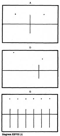
diagram xxviii(1).
a, d, g
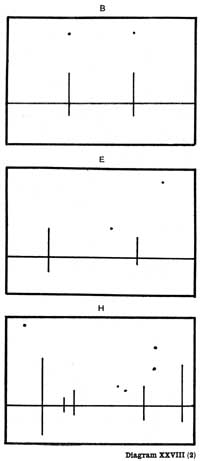
diagram xxviii(2).
b, e, h
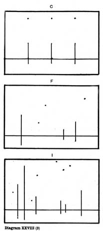
diagram xxviii(3).
c, f, i
in b and c the proportions of the third and the quarter are shown, producing the same static effect as the half, although not so completely.
at d, e, f the same number of lines and spots as we have at a, b, c have been used, but varied as to size and position, so that they have no obvious mechanical relationship. the result is an expression of much more life and character.
at g, h, i more lines and spots have been 236added. at g they are equidistant and dead from lack of variety, while at h and i they are varied to a degree that prevents the eye grasping any obvious relationship between them. they have consequently a look of liveliness and life very different from a, b, c, or g. it will be observed that as the amount of variety increases so does the life and liveliness of the impression.
in these diagrams a certain static effect is kept up throughout, on account of our lines being vertical and horizontal only, which lines, as we saw in an earlier chapter, are the calmest we have. but despite this, i think the added life due to the variety in the proportions is sufficiently apparent in the diagrams to prove the point we wish to make.
as a contrast to the infinite calm of raphael's "madonna," we have reproduced tintoretto's "finding of the body of st. mark," in the brera gallery, milan. here all is life and movement. the proportions are infinitely varied, nowhere does the eye grasp any obvious mathematical relationship. we have the same semi-circular arches as in the raphael, but not symmetrically placed, and their lines everywhere varied, and their calm effect destroyed by the flickering lights playing about them. note the great emphasis given to the outstretched hand of the powerful figure of the apostle on the left by the lines of the architecture and the line of arm of the kneeling figure in the centre of the picture converging on this hand and leading the eye immediately to it. there is here no static symmetry, all is energy and force. starting with this arresting arm, the eye is led down the majestic figure of st. mark, past the recumbent figure, and across the picture by means of the band of light on the ground, to the 237important group of frightened figures on the right. and from them on to the figures engaged in lowering a corpse from its tomb. or, following the direction of the outstretched arm of st. mark, we are led by the lines of the architecture to this group straight away, and back again by means of the group on the right and the band of light on the ground. the quantities are not placed in reposeful symmetry about the canvas, as was the case in the raphael, but are thrown off apparently haphazard from lines leading the eye round the picture. note also the dramatic intensity given by the strongly contrasted light and shade, and how tintoretto has enjoyed the weird effect of the two figures looking into a tomb with a light, their shadows being thrown on the lid they hold open, at the far end of the room. this must have been an amazingly new piece of realism at the time, and is wonderfully used, to give an eerie effect to the darkened end of the room. with his boundless energy and full enjoyment of life, tintoretto's work naturally shows a strong leaning towards variety, and his amazing compositions are a liberal education in the innumerable and unexpected ways in which a panel can be filled, and should be carefully studied by students.
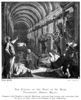
plate xlix.
the finding of the body of st. mark tintoretto (breda, milan)
compare with raphael's ansidei madonna, and note how energy and movement take the place of static calm in the balance of this composition.
photo anderson
a pleasing proportion that often occurs in nature and art is one that may be roughly stated in figures as that between 5 and 8. in such a proportion the eye sees no mathematical relationship. were it less than 5, it would be too near the proportion of 4 to 8 (or one-third the total length), a dull proportion; or were it more, it would be approaching too near equality of proportion to be quite satisfactory.
i have seen a proportional compass, imported from germany, giving a relationship similar to this 238and said to contain the secret of good proportion. there is certainly something remarkable about it, and in the appendix, page 289, you will find some further interesting facts about this.
the variety of proportions in a building, a picture, or a piece of sculpture should always be under the control of a few simple, dominant quantities that simplify the appearance and give it a unity which is readily grasped except where violence and lack of repose are wanted. the simpler the proportion is, the more sublime will be the impression, and the more complicated, the livelier and more vivacious the effect. from a few well-chosen large proportions the eye may be led on to enjoy the smaller varieties. but in good proportion the lesser parts are not allowed to obtrude, but are kept in subordination to the main dispositions on which the unity of the effect depends.
